
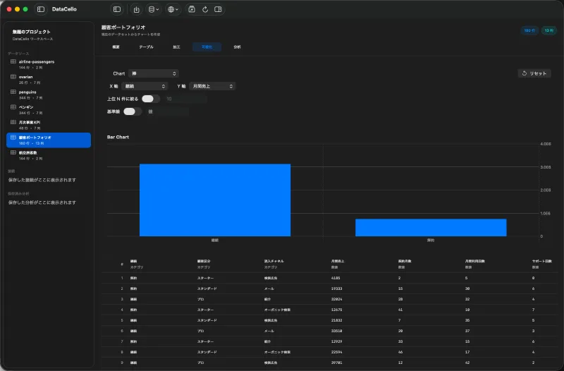
Columns you need
Prepare a categorical product field and a numeric sales field. Repeated products are expected when each row is an order line. Check that sales is numeric; a currency symbol stored inside text can prevent numeric aggregation.
Build product totals
- Select the detail dataset in the sidebar, click
Table, then open theWrangletab. - Turn on
Aggregate Rows. - Set
Group Byto the product field, chooseSum, and select the sales field as the value. - Name the result
Sales Totaland inspect the preview. - Click
Create Datasetto create one row per product.
This aggregate operation uses one group-by column. It is not a multi-key grouping workflow for product and store together.
Compare the Top N
- Select the derived dataset, click the
Visualizetab, and choose a bar chart. - Set the product field on
X Axisand sales total onY Axis. - Turn on
Filter to Top Nand enter the count inTop N. - Compare the bars and values to see where sales are concentrated.
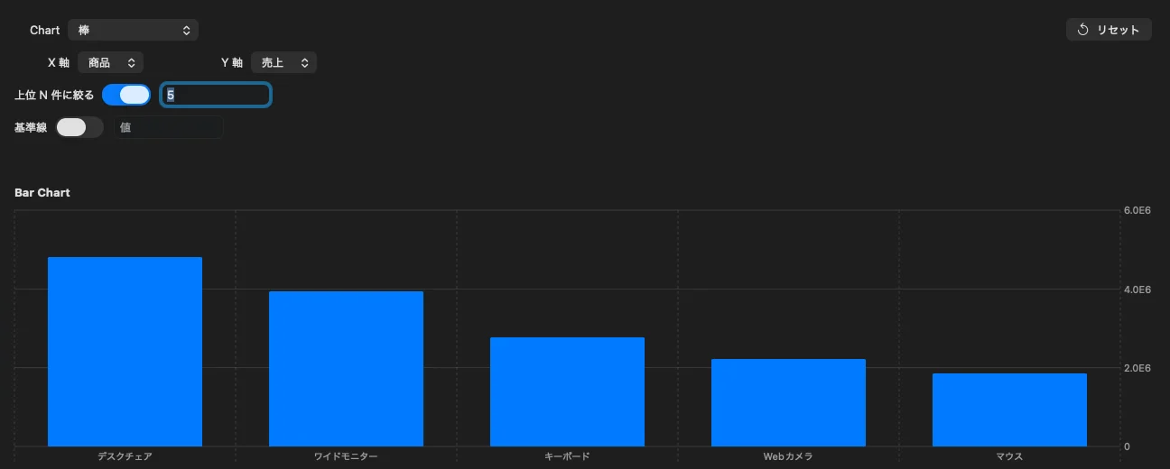
Interpret the result
A ranking identifies high totals but does not explain why they are high. Compare units, price, period, or campaign status before making a decision. Chart image export and shared dashboards are not part of the current app.